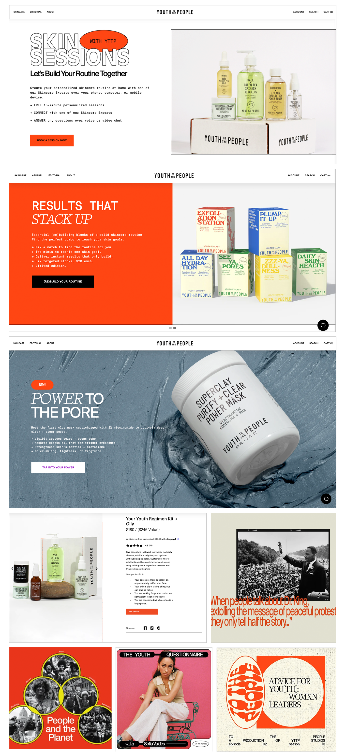
Youth to the People had recently gone through a re-branding effort and it looked great! The problem was to find Art Directors and Designers who could roll with the newly re-branded design system.
We spent about a week of back and forth with comps in InDesign trying to nail the look and feel. I pushed the typography hard to match their period based brand. The solution was to add more modern typography and photo styles to their overall design system. We wanted to mix the older with the newer.
Since the launch, they've continued to expand on the design system we built together and I still consult with them from time to time as they grow their brand.